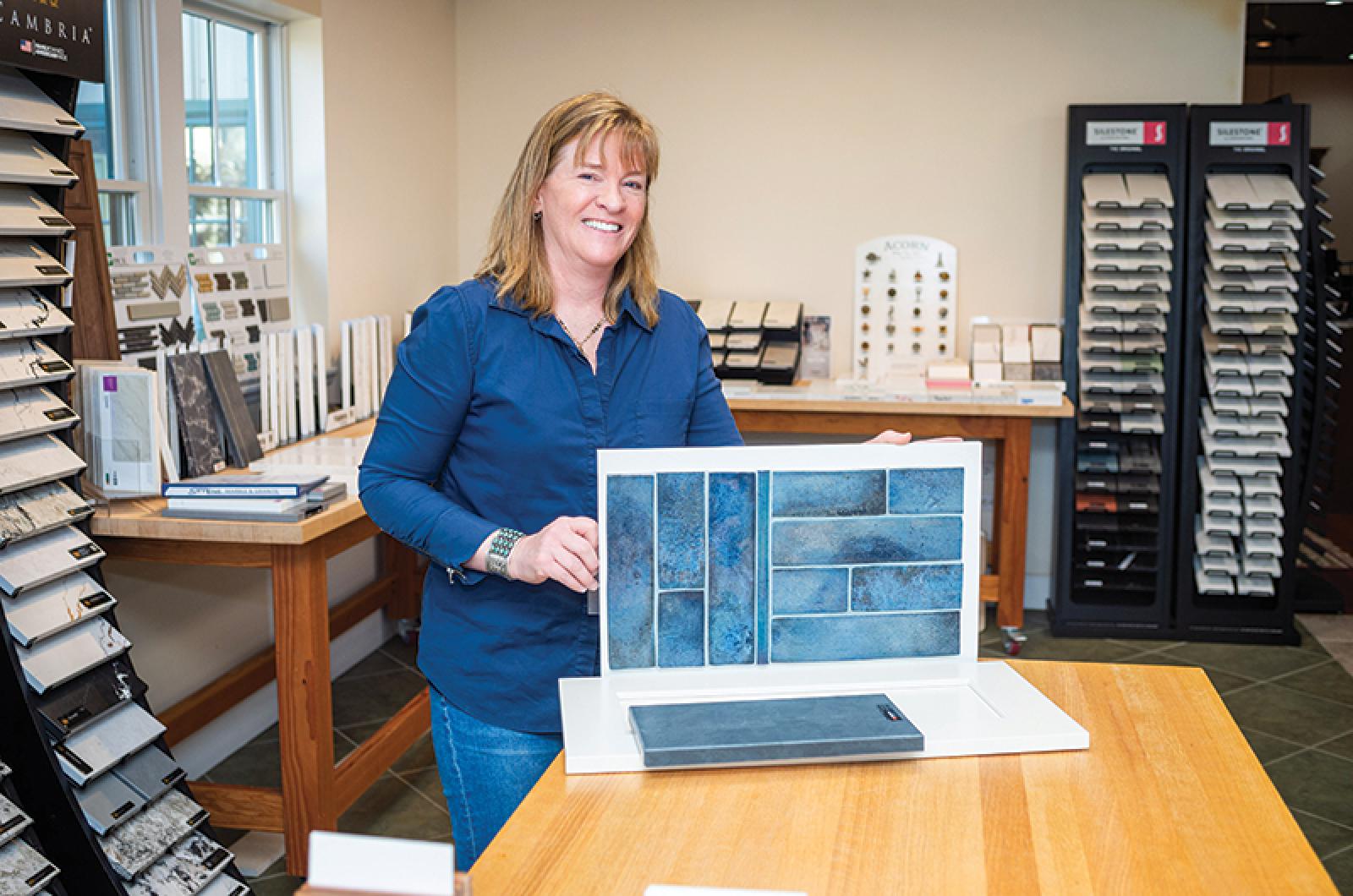
Creating a kitchen with that quintessential Vineyard vibe is much easier with an experienced kitchen designer. And behind many admired Island kitchens is design guru Nina Howell of Vineyard Home Center. A fine arts major and jewelry maker, Nina brought her talent to the realm of kitchen design when she and her family moved to the Vineyard full-time 14 years ago. Through her work at Vineyard Home Center, Nina has cultivated invaluable partnerships with contractors and clients. And in mastering the art of creating kitchens, she has helped Vineyard Home Center win top honors in the Best Kitchen Design category of Martha’s Vineyard Magazine’s Best of the Vineyard contest for five consecutive years.
Q. Tell me about the Vineyard Design Center tucked inside the vast Vineyard Home Center.
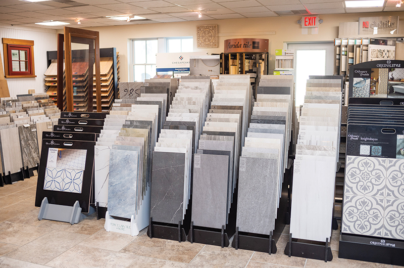
A. We have a lumber yard, a hardware store and we sell windows and doors — everything for homebuilding and renovation. And here in the middle of it all is the design center, where we focus on cabinetry, hardware, countertops and backsplashes. All of the materials come into our sister company, Hinckley Home Center on the Cape, and two times a week we truck them over here without adding the extra shipping which you might incur with Cape Cod Express.
Q. I have to mention that you are part of five generations of the artistic Moore family on the Island. Your brother Alley is an art director and your brother Andrew is a fine artist.
A. That’s why I always leave space for art w hen designing a kitchen! Our mom was an artist and high school art teacher and my dad was an architect. Growing up, we always had art projects going on. My interests were soft sculpture out of fabric and jewelry. I learned a lot from my dad who used to take me to jobsites to see the designs he was working on. For me, kitchen design just clicked.
Q. What is the role of the Vineyard kitchen in contemporary home design?
A. It’s a gathering spot for sure. And in general, people want to keep things simple with clean lines. Most clients are pretty clear that they want it to look different from their off-Island home. When I help clients who live here, they want that same clean look —glass doors, open shelving. With open shelving, I like the look, but I always caution about the dust — especially if you have renters. It’s not that practical.
Q. Good tip, but too late for me! To achieve this simple and clean design, is there a specific material to which you steer your clients?
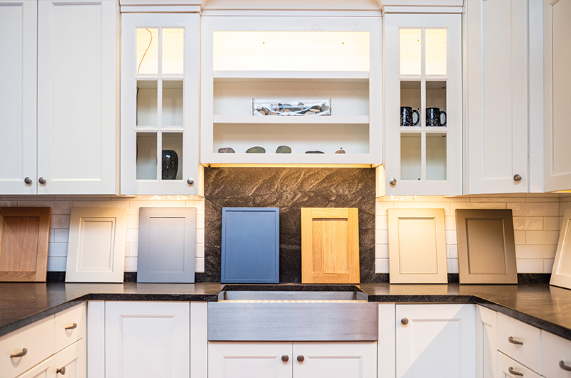
A. I would say it’s more a discussion about the look of the cabinets – raised panel versus flat panel. The raised panel is more decorative, but most tend to go towards a flat panel door. There’s lots of different options for a flat panel with simple trims.
Q. What kind of hardware statement do you suggest on simple flat panel cabinetry? A. People do all sorts of things. That’s where they kind of have fun! Q. Is the customer usually right when they’re having so much fun?
A. The customer’s always right. I guide — always give my opinion — but they don’t have to take it.
Q. Is there a more eco-friendly trend in cabinetry manufacturing and materials?
A. The finishes in the paint are much more durable and eco-friendly. They’ve come a long way with that.
Q. Let’s talk about new cabinets versus refurbishing existing cabinets. In the end does it cost just as much to do new cabinets?
A. My advice is if you are happy with your layout exactly as it is and if the guts of your cabinets are in good shape — the boxes and the door glides —then it’s possible. If you want to start changing the layout, it doesn’t make any sense. If your cabinets are in good shape, you can paint them and put in a new countertop and knobs and pulls and you’d be happy.
Q. What’s another strategy for saving money in a kitchen project?
A. There are all sorts of ways to save money. There are different door styles for sure. Someone will just love a style and then there is one that is slightly different and it’s going to be a whole two levels down in pricing.
Q. What about with countertops?
A. Same thing. If our vendors stock the countertop, then it’s going to be so much less than a special-order item. Again, if they say they love this counter, I ask, "Could you fall in love with this one (a stocked item)?" I guide them to some choices to help them save some money for sure.
Q. What’s a good direction in the stocked countertops? What’s your favorite?
A. There’s granite, natural quartz and marble, and I love natural stone, but it’s just not as durable and can be a little busy. There are a lot of manmade [engineered] quartz products which are non-porous and don’t stain. Great for rentals and if you just want a calm look.
Q. I got excited about a trendy color choice when we did our kitchen, and three years later I’m not seeing that color (gray!) in the design magazines.
A. I’m not a huge trend follower for that reason – I just think it’s going to go out. I would prefer that the clients think about what their favorite colors are and what they want to use in their house. If you are going through magazines and you do see something that you love, then great, but don’t Google today’s trendiest color and go with that!
Q. Is there a cabinet color that’s always a good bet?
A. White. There are a lot of whites. I have a favorite, frosty white, from Executive Cabinetry, which is just a step down from white-white, a little bit warmer and goes with a bunch of different countertops. You can put color in the details in decorative items, utensils or paintings, or in the backsplash where there are so many choices.
Q. What’s your advice when it comes to storage solutions?
A. When I’m designing, I always like the client to take the design plan home to their kitchen and mark it up and see if they need more space for utensils or trays or bowls. Everyone is so different in how they store things, so it’s a good exercise. A microwave built into the hood with a fan is also a good solution for small kitchens. I love small beverage fridges in the kitchen island. Where the coffee machine is going to go is an essential discussion to have.
Q. How does the contractor-client relationship work?
A. Most of my clients are sent to me by my contractors, and we go through the design books together. Then I do my own site measurement and design using a program which has all the companies so I can pull in all the different cabinet choices.
Q. If I started this spring when would I see a new kitchen?
A. April is like the worst time to start a project unless you want a kitchen in the fall. If you want a kitchen in the summer start in the fall. The cabinetry production takes seven to 12 weeks. With all the back and forth, plan for at least three months.
Q. How many kitchens are in production right now?
A. I probably have 15 kitchens in different stages. It used to be busy in the spring and busy in the fall and not as much in the summer and the winter, but those lines are blurring.
Q. Finally, what’s your kitchen like?
A. It’s white with a quartz counter. I do have a lot of great artwork. With a few artists in the family, that’s easy. But the smartest thing we did was a bay window; for a small kitchen, it just opens it out. I have a different counter on the bay window than I do in the kitchen as an accent.
Sissy Biggers is a regular contributor to the Vine and a frequent contributor to Martha’s Vineyard Magazine.
Vineyard Kitchens – White For the Win
Kitchens featuring mostly white cabinetry are popular on the Vineyard for their clean, coastal, timeless appeal. Nina Howell of Vineyard Home Center recommends starting with white and adding pops of color through artwork, backsplashes, countertops and perhaps a different color for the cabinetry on an island. Photos by Nina Howell.

Left: The owners of this kitchen incorporated a grandmother’s butcherblock chopping block into new cabinetry and highlighted it with a custom backsplash. Right: This mostly white Vineyard kitchen gets a boost of soothing seafoam color in the island cabinetry.

Left: The owners of this Vineyard kitchen chose a full-height quartz backsplash to go behind their stove. Existing brickwork adds texture. Right: Well-placed artwork, a blue subway tile backsplash, and a dark countertop for the sink area add color accents to this clean, open kitchen.


Comments