The one underlying maxim in advertising is to stand out. Use a cute puppy in your TV spot. Hire a celebrity for your magazine ad. Create an earworm for your radio jingle. Get people talking.
But at one point in time, standing out was a simple matter of font size. Maybe some creative spacing, too.
Anna Carringer, assistant curator at the Martha’s Vineyard Museum, indicated a fading Vineyard Gazette from 1863 that is part of the museum’s new Art of Advertising exhibit opening today.
“They were working with very little. This is getting your attention,” she said, pointing to a boldface advertisement. “Whereas this [a small font size] is not.”
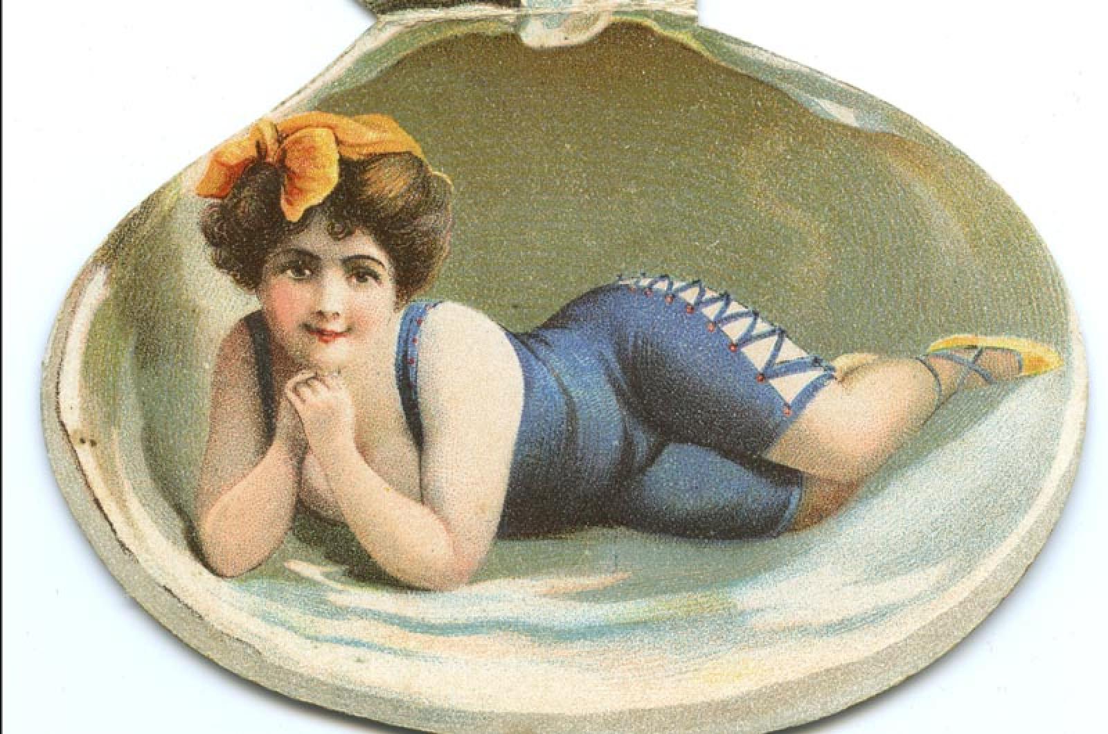
Newspapers provided the main means of displaying ads in the early days, but trade cards for businesses were also used. The late John Bent, who owned a store on Main street in Edgartown, used a clamshell-shaped card featuring a model in a bathing suit — a bit of a risque decision in the late 19th century.
If this makes you wonder who John Bent was, the new exhibit offers a way to fill in some of the gaps. The exhibit includes video interviews from Linsey Lee’s oral history collection. The interview of Mr. Bent provides a three-dimensional picture of the friendly shopkeeper who rented a garden plot to grow his vegetables. Today he is largely remembered not for his advertising but for his elaborately carved gravestone.
Other videos illuminate the fact that more often than not, people do remember a good advertising campaign.
“Priscilla was very interested in merchandising her candy,” the late Ted Meinelt recalls in one interview about Priscilla Hancock’s shop, which sold “the Chilmark Chocolates of its time,” according to Ms. Lee. The boxes for Ms. Hancock’s chocolates, as well as her store signs, were professionally designed by maritime artist Percy Cowan.
Combing through the oral histories provided “side surprises,” Ms. Lee said. Large posters of Saturday Evening Post covers from the 1940s and 1950s were hung in Island gathering places as a way to advertise the magazine. The covers in the exhibit are a veritable Vineyard Where’s Waldo, featuring locals such as Phronsie Conlin and Sam Low of Harthaven. And when these covers of the Post circulated throughout the country with their depictions of gingerbread cottages and Menemsha docks, they provided advertising for the Vineyard itself, another theme of the exhibit.
“The earliest advertising is really getting people to come for summer camp meetings, but by the 1880s, 1890s you get a lot of . . . trying to get people to come see more of the secular side of the Vineyard,” Ms. Carringer said.
Boat and train brochures emphasize how easy it was to get to the Vineyard, while other pamphlets promote the Island as a health retreat.
But newspaper advertising had its limits in the early days, as evidenced by another oral history.
“You must remember, they did not have radios,” the late Dean K. Denniston, Sr., says of advertising events at the Tabernacle. “They did not have television on the Island. They did not have a daily newspaper. So, in order for people to know what was going on, you would take this handbill and stick it underneath their door every day. We’d go all up East Chop, lower Circuit avenue, Pequot avenue . . . .”
Each of the oral histories underscores the fact that when it comes to advertising on the Vineyard, a local, personalized touch was needed. The local element also appears in political campaigns, where candidates went door to door to promote themselves, and in newsletters sent out by businesses.
“That is a change from the stock [advertising], as people have the facility to make their own things. [Advertising] becomes a much more personal issue,” Ms. Lee said.
It’s also a thread that continues through the present-day. The most recent Martha’s Vineyard Hospital capital campaign featured portraits of Islanders by renowned Vineyard graphic designer Carol Kolodny.
“She really took that down to the community level,” Ms. Carringer said of the hospital campaign.
Ms. Kolodny was also responsible for some of the most well-known Vineyard icons — graphics known internationally (the Black Dog) and locally (the Donaroma’s logo). In her oral history, Ms. Kolodny discussed one of the seismic changes to the advertising landscape: the arrival of the personal computer.
“Carol talks a lot about that transition...she was doing this painstaking work with one color per level when she was doing printing and graphics,” Ms. Carringer said. “It was a laborious process and they were only allowed a certain number of colors. So once computers came along I do feel like things got incredibly colorful.”
“The Black Dog stuff [in particular] is really amazing,” she said. “They went wild.”
Ms. Carringer said that nearly everything in the exhibit comes from the museum’s own collections.
“Things have these legacies that [people] don’t really think about,” Ms. Carringer said. “Each piece has its own little story.”
The Art of Advertising opens Friday, Feb. 7, at the Martha’s Vineyard Museum. An opening reception will be held from 5 to 7 p.m.


Comments
Comment policy »